Thursday, April 24, 2014

Lighting in Durham, NC

I'm in Durham, North Carolina for a meeting, and since I've got jet lag I was out at 3 in the morning to use the Loss of the Night app and take some photos of the street lights here for the view from your app series.

There seems to be a mix of streetlamps here with the lamps changing from one pole to the next. I annotated the photo below to show the difference in glare between poorly designed lamps and full cutoff lamps:
 
Streetlamps by Christopher Kyba is licensed under a
Creative Commons Attribution 4.0 International License.
If you zoom in, you'll see that you can just barely see the glow from the well designed lamps. They put all of their light where it's needed, and don't send it way down the block to distract drivers! The photo below was taken by Connie Walker, and shows the kinds of poorly shielded lamps that are typical in this part of town:


I saw a lot of examples of incredibly bad parking lot lighting, and this was the worst:

Dark shadows by Christopher Kyba is licensed under a
Creative Commons Attribution 4.0 International License.

The lamp is basically inside of a tree, so there is a huge area of the parking lot that's unlit. It's not a real streetlight, it's just a floodlight tipped at an angle, so that it sprays light everywhere - except on half of the parking lot! You can see that it shines directly into the house windows as well - and that someone is awake (a light is on). Maybe they have insomnia because of the glaring lamp shining in their bedroom?

Floodlit house by Christopher Kyba is licensed under a
Creative Commons Attribution 4.0 International License.

I really don't understand what's going on in the next two photos. There is a really bright and poorly directed floodlight, but I'm not sure if it's supposed to be lighting the parking lot or the building facade. In the first photo, you can see that it's a really glaring light that is particularly poorly situated: right before drivers will make a left turn through a pedestrian crosswalk:

Turning hazard by Christopher Kyba is licensed under a
Creative Commons Attribution 4.0 International License.

I often hear that lights are bright in the US because of fears of litigation. But couldn't a driver that hits a pedestrian blame it on the glaring floodlight and sue the business? The next photo shows how glaring the lamp is for pedestrians:

Glaring lamp by Christopher Kyba is licensed under a
Creative Commons Attribution 4.0 International License.

And finally the business itself. At first I assumed that this was supposed to be facade lighting, but after seeing more parking lots I think the facade lighting may be accidental:

Lit facade by Christopher Kyba is licensed under a
Creative Commons Attribution 4.0 International License.

Here is a gas station that should really be using recessed lighting. It would eliminate the glare, and leave a similar brightness at the pumps:

Poorly lit gas station by Christopher Kyba is licensed under a
Creative Commons Attribution 4.0 International License.

You can see the same kind of floodlight disaster on part of the parking lot of the station:

Floodlit parking lot by Christopher Kyba is licensed under a
Creative Commons Attribution 4.0 International License.

But right across the street is a WONDERFUL example of how parking lots should be lit! Just look at how little glare there is! The parking lot itself had extremely good visibility, and was very well lit. Of course, since the bank is closed at 3 am, it's unclear whether the lamps need to be on...

Well lit parking lot by Christopher Kyba is licensed under a
Creative Commons Attribution 4.0 International License.

Finally, here are the glaringly white lights of our hotel parking lot. The surface brightness was probably similar to the photo above, but it was much less comfortable to walk there because of the glare:

Parking lot with glaring lamps by Christopher Kyba is licensed under
a Creative Commons Attribution 4.0 International License.


In case anyone wants the original copy of the first image (e.g. to translate the text), here it is:

Streetlights by Christopher Kyba is licensed under a
Creative Commons Attribution 4.0 International License.

Tuesday, April 22, 2014

The Loss of the Night app is 1 year old!

The Loss of the Night app went into the play store on April 22, 2013, so today is the app's first birthday!


Since that time, we started this blog, we held our first Flashmob for Science, we upgraded the app to support 11 languages, and most importantly, we've had over 11,000 observations submitted! Most of the observations were taken by people using the app under non-ideal conditions (e.g. with clouds or the moon out), but tonight we will probably reach our 1,500th observation with data that we can use for analysis!

The app's birthday means that we are going to start to have data taken at the same location in multiple years. The major scientific goal of this project to understand how the sky is changing as the world transitions to LED lamps. This is something we can't measure with the current Earth night observing satellites because they are not sensitive to the blue light that is typical of the most energy efficient LEDs. (And also because they look at the ground, not the sky!) We can only get these measurements by having people from around the world look up.

I think that 1,500 observations in the first year is a great start, but we really need your help to expand further! The more observations we have, the more accurate our measurement of the change in the night sky will be, and the more quickly we will be able to report it. So please, tell your friends and family about the app, post a link to the download site on Facebook, and the next time you have a clear night sky in your city, please go out and do a measurement!

Other ways you can help:
  • We would love to hear back about your experience with the app, especially if you had any problems, or if you have recommendations for how we can improve it! Please comment here
  • We are looking for translators for future releases.
  • We want photos of good and bad lighting for the view from your app series.
  • We are looking for a landscape photo taken in an area with no light pollution on an overcast moonlit night.
You can now view the data you submit on the GLOBE at Night map page. It should appear there within a few minutes of your data being transferred. If you zoom in and find your point, you'll get a bit of feedback about how bright the sky was, and the range over which you are uncertain whether stars are visible or not. (Please note that this is a preliminary analysis, and in some specific cases the algorithm that calculates the range doesn't work properly.) This information will be available to you immediately in the next release of the app (we are still working on securing funding).

Thanks again to everyone who has contributed data! Without you, there would be no project!

Dark Sky Meter app is currently available for $0.99 download!

Great news, tell all your friends with iPhones and iPads!


Our "Loss of the Night" app was publicly financed, and is available for free download for Android devices:

Monday, April 21, 2014

Representations of the moon in art

It's day 2 of International Dark Sky Week, and the moon is fading towards a crescent, visible only in the early morning. That means that it's a great time to use the Loss of the Night or Dark Sky Meter apps, or to contribute to GLOBE at Night using the regular webapp. To celebrate the crescent moon, here's a post about depictions of the crescent moon in art.


If you saw a painting of a scene that included a coniferous tree filled with blossoms or fruit, it would be incongruous, and unless it was done intentionally it would probably somewhat spoil the painting. Similarly, if shadows are drawn incorrectly it can distract from the image, which is why shading is taught to aspiring artists early on. Unfortunately, these lessons often don't extend to the shading of the moon, and representations of the moon in contemporary art are often (or more likely usually) incorrect. (Check out these tips to learn how to draw the moon correctly!)

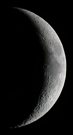
The moon is most often depicted as a crescent, and there are two problems that frequently pop up. The first is that the real crescent moon is lit from the very top to very bottom:

Crescent-moon
Crescent Moon by Thomas Bresson from the Wikimedia Commons

Many artistic depictions of the crescent moon extend considerably past the top and bottom of the moon:

Golden Crescent Moon

Golden Crescent Moon by Dcubillas from Wikimedia Commons

The second problem has to do with the orientation of the moon and the surroundings. If you think of the crescent moon as an arrowhead, it always points towards the sun, and because the crescent moon occurs near the new moon, it's always close to the sun in the sky. So a "D" shaped crescent moon is low in the sky and sinking after sunset (in the Northern Hemisphere), and a "C" shaped crescent moon rises shortly before the sun. (Apparently, right handed artists prefer to draw the C shape, making their images look like early morning rather than evening).

Once you know a bit about the moon, incorrect depictions jump right out at you, and can spoil the art. For example, in the generally excellent "Conqueror" series of books about Ghengis Khan, the moonrise or moonset were often incorrectly described, which isn't so pleasant in "historical fiction". In one particularly bad case, the crescent moon rose shortly after the sun set (not possible!), and the opposing general took it to be a good omen. Since the plot could hang on a detail like this, it's unfortunate when more care isn't taken.

I have suspected for quite a while that before the advent of electric lighting, people would have been more familiar with the comings and goings of the moon, and it's made me wonder if depictions of the moon in art are were more likely to be correct in the past.

Over Easter, I visited St Mary's Church in Stralsund Germany to listen to an organ concert. While we waited for the concert to begin, I took photos of two of the church's paintings that caught my eye because of the presence of the crescent moon. The first photo shows a burial at sea:

"Seebestattung" (Burial at sea) - unknown artist, ca 1900, oil on canvas
The crescent moon is correctly depicted: it points towards the sunset in the West. We can tell it's sunset and not sunrise because the painting most likely represents a burial in the Northern Hemisphere. Since the moon is never near the northern horizon, it follows that the right hand side of the painting must be the West.

I don't know the name or any details of the second image:


Here you can see that the crescent moon is again correctly depicted, with the lit part running exactly from top to bottom, and the moon "pointing" straight to the sun. Some artistic license is used here, because stars are shown with the moon while the sun is up, but (I think) the two sides represent before and after Adam and Eve ate from the tree. (It's also interesting to me that living in Eden is depicted as being in the night, while being cast out of Eden is under the sun.)

Of course, artists are free to depict the moon (and pine trees) any way they want. But if it's going to be depicted differently from nature, artists should be aware that some segment of the population will note the incongruity, and it may spoil the work for them.